March 16, 2022 – Do you know where you were or what you were doing that day? I sure do.
It was a regular Wednesday for everyone else. For me, not so much. It could have been raining cats and dogs or Instagram could have been down, and I wouldn’t have known. I was focused on one thing — the launch of our new brand identity and redesigned website.
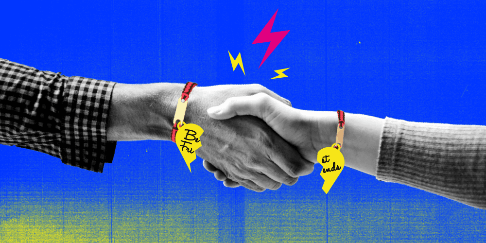
Hi, I’m Michelle, and I’m the lead designer at Drift. I once wrote a blog about how marketers and sales reps can become best friends — I’m talking about matching friendship bracelets, name-tattooing-in-hearts best friends — with their in-house designers and work seamlessly to produce some creative magic.
Because when sparks fly between these teams, a one-pager, a 48-page slide deck, a digital ad campaign, or even a complete overhaul of your company’s brand is all the more exciting and baked in the right sauce.
So, with a little sprinkle of sass and a whole lot of reality, I’m back now to tell you how this alignment helped our rebrand go above and beyond the everyday marketing activity magic.
I’m looking back on the preparation, the process, the love, the sweat, and honestly some tears leading up to the big day. So if you’re looking to redefine your go-to-market strategy, to make a brand splash in an overly saturated market – or maybe you’re just a big design lover like myself — you’re in the right place. Whether you take just one snippet from this blog, send the whole thing to your in-house creative team, or simply get a chuckle along the way, my design heart will be delighted.
From a Team of 1 to a Team of 5
I used to (emphasis on used to) turn serial killer images of smiley stick figures drawn by idea-crazed, black hoodie-wearing, off-the-wall, marketers into live, converting pages.

Now, I’m a part of this massively creative, powerhouse team that develops scalable design systems and elements, but most importantly, creates a brand that sets Drift far apart from the crowd — all while maintaining our roots of being not just another SaaS company.

The History Behind the Rebrand
The 2022 redesign wasn’t Drift’s first go at a rebrand.
In November of 2020, Drift tried to rebrand itself to mature and move up-market and be “enterprise.” But we rushed to execute and lost our personality in the process. We designed ourselves into a corner. Nobody puts baby, I mean Drift, in a corner.

We overcorrected while climbing the ladder and, as painful as it was to admit, we needed to try again. We had to resolve the unfinished brand visual language from before.
The in-house design team and I accepted the challenge. I could write an entire blog on the nitty gritty, Asana-ticket-creation, spreadsheeting-building, whole redesign process, but alas our attention spans won’t last. Instead, here’s a little peak behind the curtain on how we redefined Drift’s brand language:
Step 1: Draft the creative brief
Before we could get started designing anything, we needed to determine our North Star. This would be the ideal look and identity we wanted to end up with at the end of the process. Shoot for the stars, then scale back when necessary.
How We Determined Our North Star
By figuring out what we wanted and didn’t want in our brand, the design team had its North Star:
- We didn’t want to look like every other SaaS tech company. While the SaaS masterminds (not to be mentioned so they don’t come after me) have created a space, they lack personality and blend together. We’re not your average tech company, we wanted to stand out from the rest — just like we did in 2018!

(Image source: Medium) - We did want to avoid doing the same thing as November 2020 and expecting different results. It’s insanity. Albert Einstein knows.
- We did want this redesign to be long-lasting, scalable, and applied to a number of channels — but still allow us to evolve as we grow each year. Take ourselves out of that corner!
- We did want to define our brand pillars. How will our customers and brand fanatics describe the values and characteristics that make up our brand?
At every touchpoint, Drift leads with influence creating engaging experiences and telling compelling stories. We make it personal. We make it human. We make it smart. We do it because it’s the best for the brand and for the customer. We are authentic, innovative, and dynamic. We are Drift.
Step 2: Set Design Requirements
You know how doctors take a Hippocratic Oath? Well, this was our oath. Our very own design rules and requirements:
- Don’t lose sight of who Drift is, where we’ve been, and who we want to be. Drift is innovative and polished, but not rigid or stuffy. We push the envelope and our design should do just that.
- Always keep our personas and use cases in mind while designing. They are marketing and sales professionals, but they are humans too, not just leads.
- Keep and lean into the design and brand elements that work: our logo, our lightning bolt and chat icons, black and white, high contrast color, large bold type, people and faces first, and an emphasis on typesetting and editorial design.
- Seek and pull inspiration from our role models: B2B companies like Notion, Figma, Slack, and Mailchimp, B2C companies like Apple, Squarespace, Klarna, and Spotify, the editorial icons of Medium, The New Republic, The New York Times, and the fashion gods: Off-white, Nike, Chanel, and Diesel.

- Properly scope, test, and follow best UI practices/accessibility. We want to launch an iconic brand, but the design means nothing if the site doesn’t work or is a terrible user experience. Be purposeful, establish design patterns and consistency, provide design hierarchy, determine component behavior, build templates, and create consistent actions and interactions across the site. Nothing should feel jarringly different or too similar.
Step 3: Define Process and Phases
While we always do our best to follow process, sometimes we need to spell it out to make sure we don’t deviate from the plan. The process will vary slightly from team to team, but these are the key steps we took to make it all happen:
- Conduct an audit of your current design language. It’s always important to look back and reflect on all of the design elements and systems next to each other to see how they’re working (or not working) together. Once we conducted our audit, I gathered our findings and determined what pieces we should keep and what should ultimately be left behind.

- Determine high-priority items and level 1 pages. These could be things like the homepage, product pages, site architecture, pricing page, search engine optimization, social and digital promotion. Determining what is “high priority” is a big and challenging task since everything could be a priority — it just depends on who you ask. We prioritized by looking at the data: Things like page views, average time spent on page, and bounce rate.
- Design. Test and sketch out some design explorations given your design requirements. Start with mood boards, screenshots, design mockups and more design mockups, and then start all over again when you hate it all. We did this by following our North Star values. We wanted to update our typography, color palette, photography style, product visuals, icons and grid, but the limit did not exist!
- Decide, narrow down, and avoid consensus, but ultimately present your top 3 design explorations through videos, emails, and exported Figma PDFs to first your own team, then your manager, and finally, the big dogs — the CMO and CEO.
- Narrow down your explorations based on the feedback and refine again. Present that one final design that makes everyone’s heart pitter-patter and tells a story. Design should start, shift, and own the conversation.
- Celebrate. You get the email that you want to print out and frame saying, “Yes, this is it!” – it is one of the best feelings as a designer. Trust me, tears.

- Refinement and tweaking. While you may want to just move on after receiving that celebratory email, your work is far from done. At Drift, we had to ask ourselves: Did all the design elements complement each other? Could these design elements scale across all mediums? Did the color palette make us want to sing?
- Turn design components into a system. By making components and a robust design library of typography, grid, color, graphic elements, and many sections for desktop and mobile in Figma and Zeplin, we developed a design system that is scalable for web, digital, print, and any other medium imaginable.

- Reiterate. Design a page, test a page, redo a page, create templates, and then do it all over again. We did this many times for the months leading up to March 16, 2022. Work closely with your dev team to add motion, optimize images, fix bugs, test and QA. This time period could be 20 steps and it’s own blog, but you get the picture.
The End Result
In order to not lose sight of who Drift is, we pulled from our past and brought back the fresh, creative storyteller in our brand. We had those ingredients all along, just added in a little spice.
- Color: CMYK. Say it with me — cyan, magenta, yellow, black. They are here to stay forever unless there is an apocalypse and the color values we find in the world die off. Timeless and classic. When I first started at Drift, I used the unaltered, pure values of CMYK to make a splash in the market. This time around, we tweaked them to be a little more expressive, innovative, and a little bit rebellious — a nod to Drift’s roots.

- Movement: We used to incorporate texture and grit to provide a a vibrant, dynamic experience on site. It was young and loud, exactly our intention. This time, we incorporated diagonal lines and shapes to create distinctive movement and dimension to the sections on the page, to the words you read, and to the overall elements of every design. The slash motif helps us establish an editorial yet off-kilter look across Drift’s assets, which sets us apart from the traditional tech/SaaS look. We’re all a little off-kilter, am I right?

- Typography: Words matter and how we visualize these words has mattered since the beginning of time. We read a lot and can’t help but fawn over the editorial design of our favorite publications (remember our inspiration from Medium, The New Republic, The New York Times?). That’s where our typeface Balto comes in. It contrasts widely – it can be loud with big black headlines, or it can add a soft, inviting, readable touch to long form blogs. Balto also helps us maintain a confident and approachable voice throughout our content.

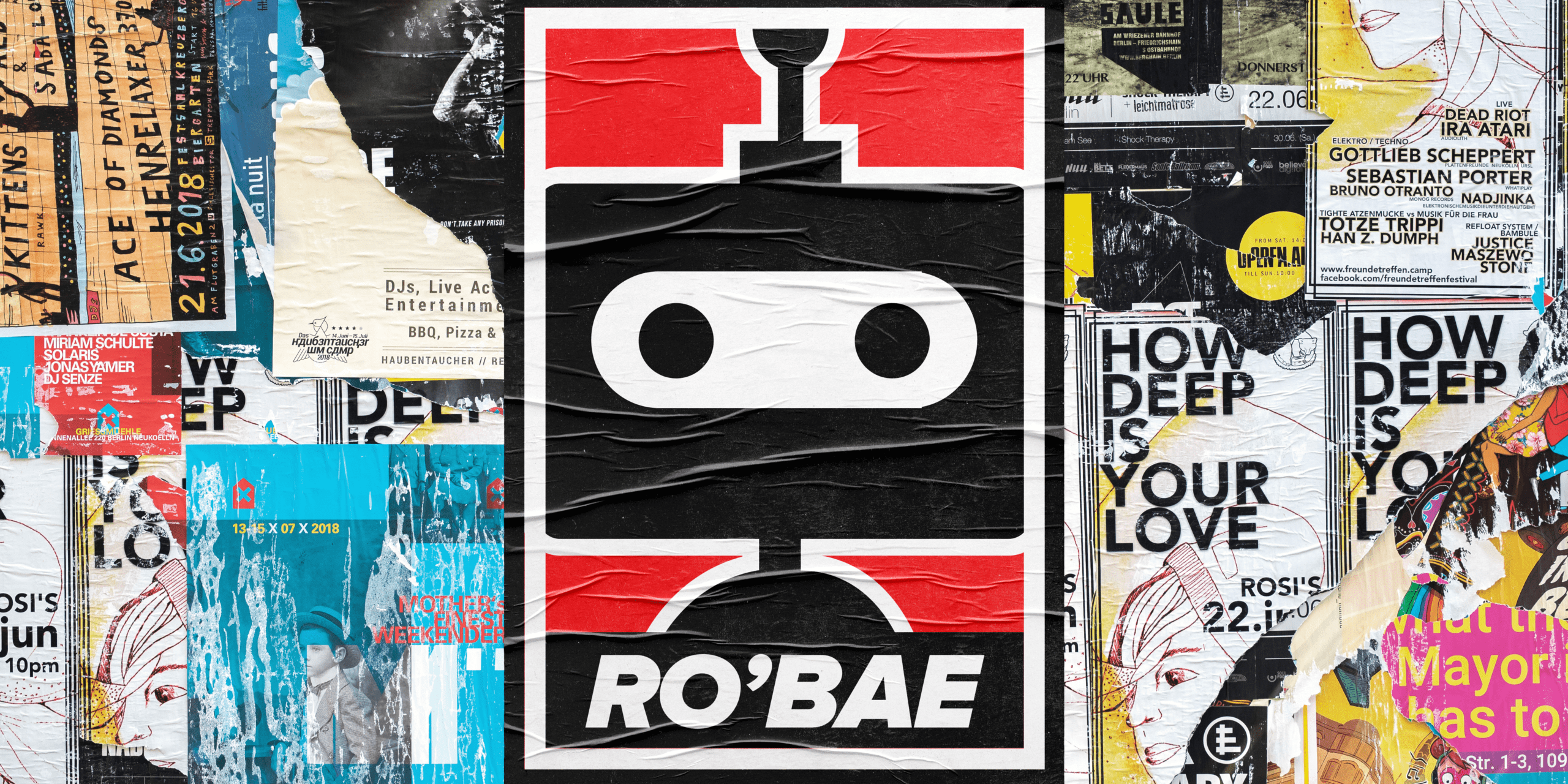
- Symbols: While most people dream about sugar plums and fairies or hopefully nothing at all if you’re a good, non-anxiety-ridden sleeper, I’m dreaming of the lightning bolt and chat message icon. It’s engraved in my mind. The new variation of our iconic lightning bolt and chat bubble symbols is a knockout version (thanks, Nike!). This knockout version follows the rules of movement and dimension — it’s juxtaposed next to a thin slash for more contrast and visual interest. The knockout symbols are used as a graphic element to further enhance our brand presence, but they never take the place of our iconic Drift logo.

- Photography: If you ever visit our site and don’t see a human, we’ve been hacked — seriously. It’s been a part of our DNA since before my time at Drift, and it’s not going away. We are a people-first company, so you will always see an employee or customer highlighted on our materials. It used to be through a candid iPhone picture taken off-the-cuff or a customer headshot, but now we cleaned up background busyness with our CMYK color palette to compliment our focal point — the person. To further pay homage to Drift’s grit, we take these high-resolution photos and juxtapose them against a grittier version – a new and improved evolution from our rebellious designs of the past.

What’s Next?
While I’m so proud of the work we accomplished in the months leading up to March 16th, 2022, I can’t help but imagine — while doodling hearts and swiggles in my diary — what’s next? The redesign did just what I wanted: it’s scalable and it has legs for days, which reinvigorates me to explore the art of the possible.
The curtain has been pulled back. And we’ve only scratched the surface. Each day I’m reminded of how far we’ve come in creating our own distinctive design language, differentiating our brand, and rediscovering our brand roots all while reinventing ourselves. We lost our way sitting in a corner while an end-of-season talent show played in the background, but we found our way back out. It wasn’t an easy feat or an easy process, but like an early designer once said: when they zig, we zag.
So, who’s in the corner now? Not us.
Thank you to all those involved, I couldn’t have done it without you.
Jess McCormick, Sarah Porter, Ruth Corson, Diane Garcia, Nik Skogsberg, Sarah Frazier, and many more.